


So this happened lol.
I was thinking more about the current (version 1.2.2.0) "back to map" button and the user experience (UX) considerations surrounding it.

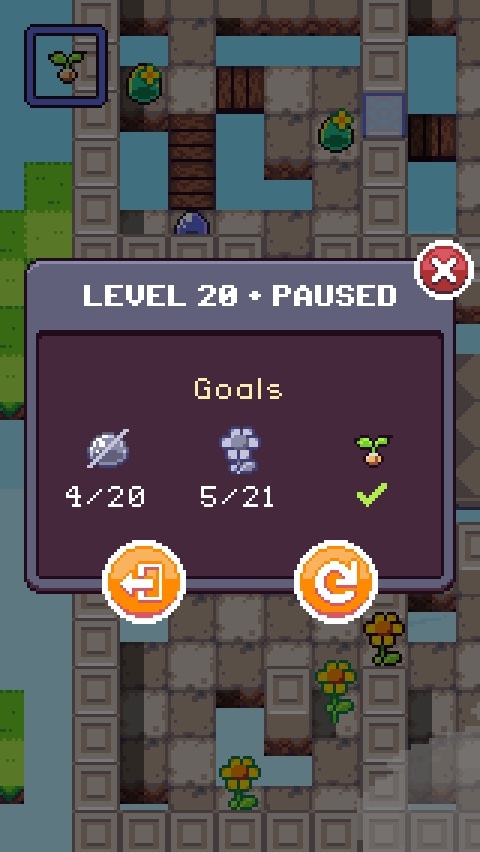
Would the player be upset if they were on a very hard level and accidentally pressed "go back to map" and lost their progress? Probably.
Coincidentally, the "retry" icon on the main view (when not paused) is actually in the "hard to reach" thumb zone for right-handed players, so at least this minimizes accidental retry for the majority of players. (According to a source on Wikipedia, studies suggest that 90% of people are right-handed). I wonder how many of you who have played this on Newgrounds are left-handed?
Is the icon clear enough? The "map" isn't exactly a traditional map in this game, as it's a vertical beanstalk. The design language of my icons is confined to a 16x16 space, so I have to be very economical about how I use pixels.
(Pardon me for nerding out. I happen to be in the UX industry lol ...)
So in the end, I decided to switch the "back to map" icon (on the main unpaused game view) with a "pause" button since the "pause" glyph is generally universally understood. Furthermore, I could utilize the pause screen to show more stuff, like the progress of your current goals. The actual "back to map" button would live on this view. In the first screenshot, was it obvious what to press to return to the map?
Upon playing around with it more, I realized that the close button is hard to reach with the thumb, so I am looking at adding an explicit "resume playing" button, and the ability to tap the scrim (the darkened background) to dismiss the pause dialog. So you may see that in the next release (along with this pause screen).
And man ... it sure was a fun time coding this. The most challenging part was activating and deactivating buttons as you switch between the paused state and the unpaused state. But once I figured that out, the rest of the work was mostly adjusting placement coordinates.
Surprisingly, the showing/hiding transition was the most straightforward. It was just a linear interpolation function that I applied to the dialog's base coordinates and opacity values. It was originally without a transition and felt very jarring for it to appear out of nowhere. Funny how little things like this make a huge impact on the feeling of the game.
Anyway, you'll see this in the next release which I'll be putting out later today.
Keep on jumpin'